Why it matters
As we all know: Public blockchains are 100% transparent and all activities of each user can be viewed by anyone at any time. This is one of the central characteristics of the blockchain space and one of the main advantages of DeFi over it TradFi. And you should definitely make use of this transparency when deciding where to invest your coins. But what’s the best way to go about this? You certainly don’t want to sift through the vast amounts of data on the chains block by block! The good news: In the meantime there are numerous super useful analytics tools and dashboards that help you to keep track of things at all times. And this is where DeFiLlama comes in!
What DefiLlama is
DeFiLlama is probably by far the most popular analytics platform for the DeFi space, it is 100% free and is ideal for being informed about pretty much everything from the DeFi world at any time; and of course based on live data sucked directly from the chains.
Personally, what I love about DefiLlama is that it not only gives you a helicopter-level overview of pretty much all relevant (and irrelevant?!) DeFi blockchains (currently DefiLlama covers a whopping 181 chains!), but that you can also use it to zoom in on individual protocols or chains to see the detailed numbers. This is not only super useful for your crypto investment decisions… but also for learning and deeper understanding the DeFi space!
Which dashboards DefiLlama offers
Of course, I’m not going to smack you with all the existing dashboards, I’ll just show you a few best-of use cases so you can get a feel for what’s possible here. And then it’s up to you to delve into the data of the DeFi space yourself with DefiLlame.
Specifically, we now look at the following dashboards:
- Top level view
- Chains overview
- Overview of DeFi categories
- Overview of possible airdrops
- Yields overview
- Overview of centralized exchanges (CEX)
- Overview of stablecoins
Top level view
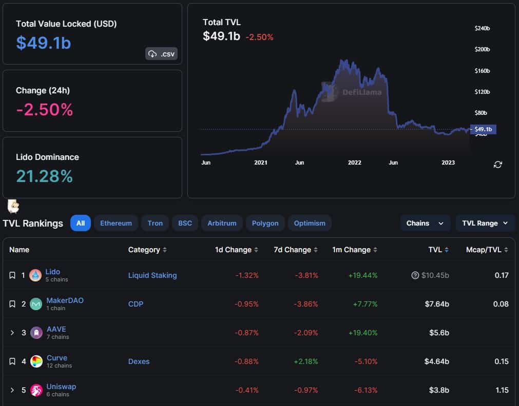
Via Top level view you will get an overview of the current status of the DeFi ecosystem as whole. Here you can see the current and historical Total Value Locked (TVL) across all chains, you can see the extent to which the currently leading DeFi protocol dominates the ecosystem (currently this is the liquid staking protocol Lido) and you are presented with a list of the biggest tokens with lots of useful numbers. For example, from an investment perspective it could be quite interesting to see which coins have a low market cap vs. TVL ratio. And of course you can also filter all the data by specific chains such as Ethereum, Arbitrum, Optimism etc. or by DeFi categories. Pretty powerful tool, right?!
Chains overview
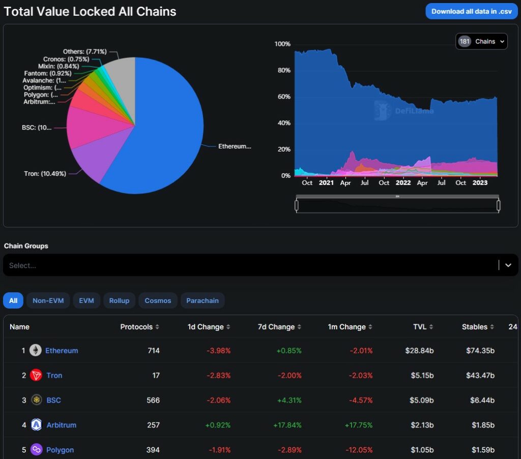
I often check the Overview of the different chains because it’s super instructive. For example, in the screenshot above you can clearly see how Ethereum slowly lost its absolute dominance step by step over the course of 2021, but has slowly regained it since July of last year. Or you see how in May 2022 the second largest DeFi chain – namely the Terra Chain – collapsed spectacularly. And in addition to TVL per chain, you also get many other useful metrics such as the gas fees earned by individual chains. And of course you can see at a glance how the L2 chains have grown massively; e.g., Arbitrum, Polygon and Optimism on ranks 4, 5 and 6. And of course you can also filter by chain types such as rollups, EVM-compatible chains, etc.
Overview of DeFi categories
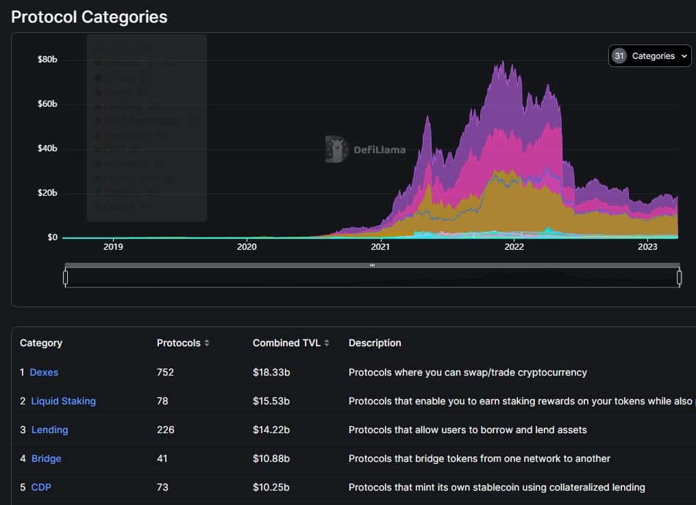
Or are you rather interested in an overview of the dominant DeFi categories? Then you should check out the page here! Once you have digested the categories overview page and you then ask yourself, for example, which are the dominant protocols in the insurance category, then you can immediately get a ranking of the individual protocols in the corresponding category by double-clicking on the category:
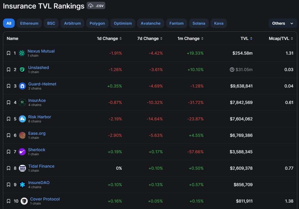
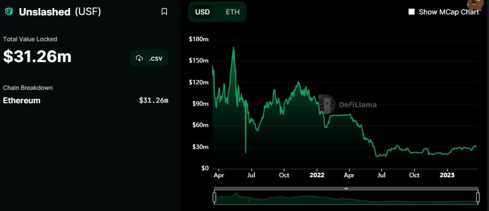
If you now look at the individual insurance protocols with their key figures, then you might next be interested in details on the Unslashed Finance protocol, which currently ranks second among the largest insurance protocols. Double-clicking now takes you to the protocol details with numerous charts, key figures, a list of the most important competitors, a link to the smart contract, links to corresponding social media pages and much more:
Overview of possible airdrops
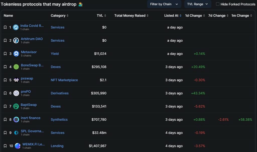
Or are you rather asking yourself which DeFi protocols will have the next airdrops. Look here for the hottest candidates for upcoming airdrops!
Yields overview
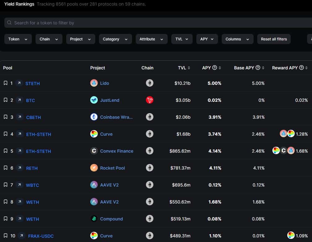
Or are you wondering with which liquidity pools of which DeFi protocols on which chains you can currently achieve the largest yield? Then this dashboard here is the right starting point for you! Of course you can also filter here almost endlessly.
Overview of centralized exchanges (CEX)
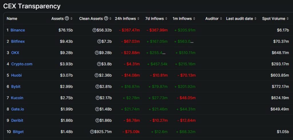
Or a classic: Are you worried whether your centralized exchange (e.g., Binance or Crypto.com) is threatened with an exodus and all users are withdrawing their coins? Then this overview here is central for you.
Overview of stablecoins
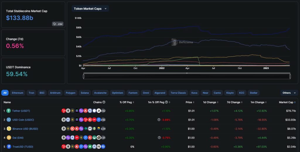
This here is also impressive: The dashboard with all the countless stablecoins. For example, did you know that Tether (USDT) has already been launched on 61 different chains? And that Tether’s market cap on Tron is bigger than on Ethereum? You can find all this and much more on this dashboard.
And so it goes on and on and on… with a seemingly endless supply of super exciting dashboards. And yes, these things are not only useful for your investment decisions. Such insights are also super helpful if you just want to better understand the DeFi ecosystem as a whole. You will learn a tremendous amount!
Well, enough written about DefiLlama now. Now it’s up to you to explore the DeFi ecosystem yourself with DefiLlama. Have lots of fun with it!
